prompt topic
AI app builders for web design
Answer in brief
An app builder is the kind of AI tool to use when you want a working site or app generated and put online from one place: you describe it in a browser, the builder creates a project in its own hosted workspace, shows it running and can publish it. Lovable, v0 and Bolt are examples of the kind. What each includes, and how you take the code out, is in the tool's documentation.
The design risk is specific. A builder starts from its own stack and its own default styling, so a brief that does not fix the look gets the builder's look.
Where it runs and who holds the code
Everything happens in the builder's workspace: the files, the preview, often sign-in, data storage and hosting. You see a running app first and the code second, if you choose to look. That order is the appeal. Somebody with no local setup can go from a paragraph to a live address in one sitting.
Before you commit a real project, find out three things from the tool's documentation: whether the code can be exported or synced to a repository you control, whether the exported project runs outside the builder, and what happens to hosting and data if you leave. These answers differ between builders and change over time, so we don't state them here.
What that means for design
A builder's first draft tends to look like its component defaults: a familiar sans, rounded cards, a soft shadow, a sidebar. None of that is wrong. It is just not yours, and every project started the same way shares it.
Your own images go in by upload, if the builder supports uploads, not by pointing at a folder. A design system holds across screens as long as you set it once at the start and the builder keeps one theme. Phone width is usually easy to see in the preview; still open the published address on a real phone before you send it to anyone.
How to brief a builder
Put the design rules ahead of the features and say that they replace the default theme. Give colours, type, radius, borders and spacing as numbers. Then name the defaults you don't want: icons you did not ask for, hero images, marketing sections around an app screen.
Describe the screens and their empty and full states after that. End by asking the builder which rules it could not follow, because a builder constrained by its component set will sometimes approximate, and it is better to hear that than to find it.
What a brief for an app builder should contain
- Design rules first, stated as replacing the default theme.
- Colours, type, radius, borders and spacing in numbers.
- The defaults to leave out, by name.
- Each screen with its rows, buttons and empty states.
- Phone first: the width to design at and what changes on a wide screen.
- A closing question: which rules could not be followed.
A prompt to start from
Build a small web app for [studio name]: a weekly class timetable where a signed-in member books a place. Two screens: Timetable and My bookings. Sign-in by [email link]. Keep classes and bookings in [your built-in database / local state for now].

Read the design rules before generating anything. They replace your default theme. Where a rule and your default disagree, the rule wins.

Design rules:
- Colours: ground #faf8f3, surface #ffffff, text #1b1a17, muted text #6f6b62, one accent [#hex] used only on the primary button and the selected day. No gradients. No shadow heavier than 0 1px 2px at 8% black.
- Type: [typeface] everywhere. Screen title 32px, weight 600. Class name 18px. Everything else 15px. Nothing under 13px.
- Shape: radius 10px on cards and inputs, 999px on buttons. Borders 1px #e4dfd4.
- Spacing: multiples of 8px only. 24px inside cards, 16px between them.
- No icons unless I name them. No emoji, no illustration, no hero image, no marketing sections.

Timetable: seven day chips across the top. Under them, the day's classes as rows: time, class name, teacher, places left and a "Book" button. A full class shows "Full" in muted text and no button. A day with nothing shows "No classes today".

My bookings: upcoming bookings as the same rows with "Cancel". Cancelling asks once to confirm.

Motion: the selected day chip slides to its new place over 0.2s. Nothing else moves. With reduced motion it jumps.

Phones first: design at 390px wide, one column, buttons 44px tall. From 900px, centre the column at 720px wide. Do not add a sidebar.

Seed it with [six real classes]. When it is built, open the preview at phone width, book and cancel one class, and tell me which design rules you could not follow.
Written for this page as a starting point; swap the parts in [brackets] for your own. The full prompt of each uberdesigner template is longer and specific to one finished design, and it is tested by rebuilding the template from the prompt alone.
Designs to hand a builder as the look
App screens, widget sets and landing pages from uberdesigner. Their prompts are written and checked for AI coding tools; pasted into a builder, expect to steer more, and treat the design's values as the rules the builder must keep.
-
oglet
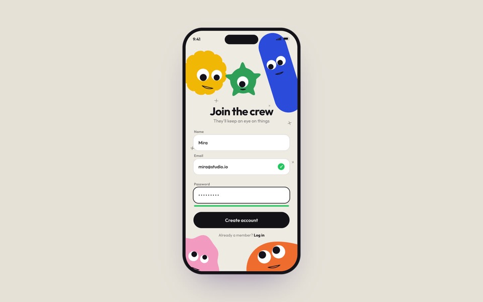
A phone sign-up screen watched by five googly-eyed characters who follow every tap, flinch at a typo and hop for joy, on an 18-second loop.
copy its prompt on uberdesigner -
wagdrop
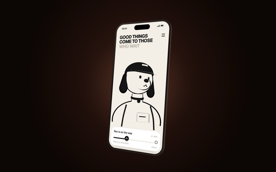
A delivery-tracking screen on a turning phone, starring Rex the courier dog: a 3D toon that reads as a flat line drawing and keeps facing you.
copy its prompt on uberdesigner -
home widgets
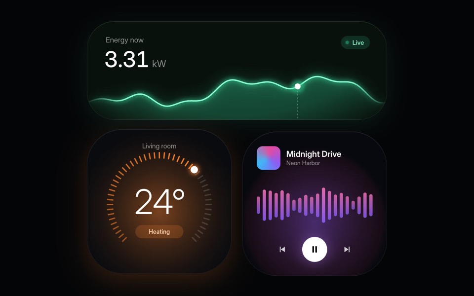
Three glowing smart-home widgets: live energy use, a thermostat dial and a music player.
copy its prompt on uberdesigner -
glass widgets
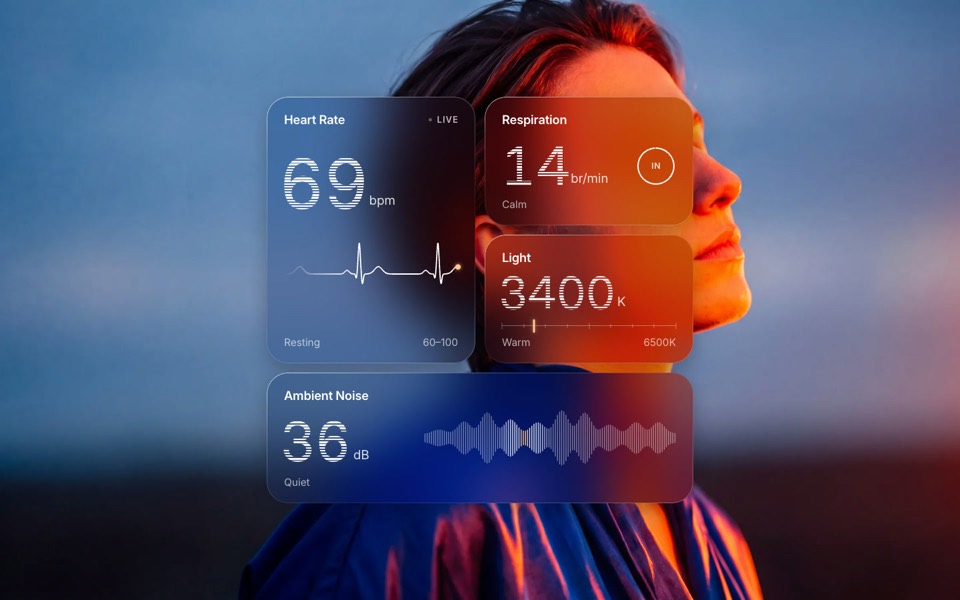
Four frosted-glass health widgets over a portrait lit blue and orange, with numbers that tick live.
copy its prompt on uberdesigner -
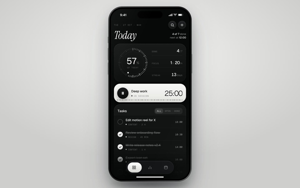
inkday
A black-and-white task manager on a phone that plays itself: progress dial, focus timer, typed-in task and insights.
see it on uberdesigner -
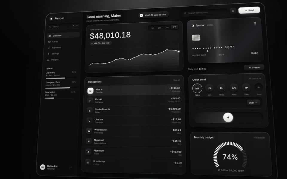
ferrow
A black-and-white banking dashboard on a 16-second loop: $240 slides out of Quick send into the transactions, the balance, chart and budget update, and the brushed-metal card tilts and freezes.
see it on uberdesigner -
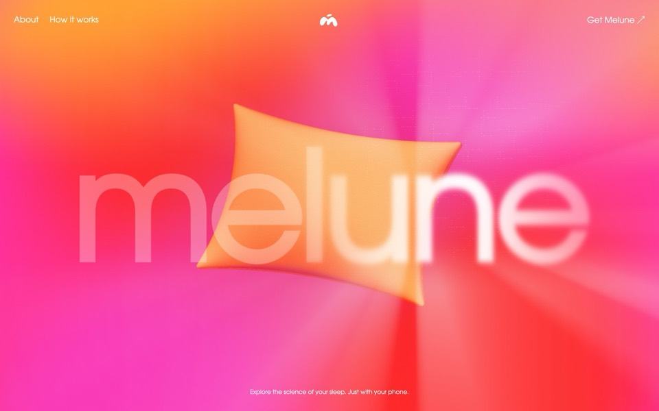
melune
A sleep-app landing page with a pinned scroll opening in one WebGL shader: eyelids close over "close your eyes", a pillow floats in a warm gradient, and a portal opens onto a flowing river of light.
copy its prompt on uberdesigner -
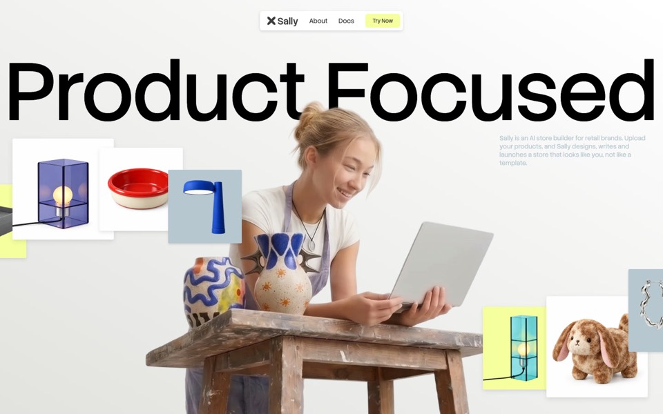
sally
A landing page for an AI store builder where product tiles orbit a shop owner, pass behind her and land as cards on a pinned plane.
see it on uberdesigner
Questions and answers
What is the difference between an AI website builder and a coding agent?
Where the project lives. A builder generates and hosts it in its own workspace, so you get a live address quickly. A coding agent works in a folder you own, so you get plain files and arrange hosting yourself. The first is faster to publish; the second is easier to move.
Will I own the code an app builder writes?
That depends on the builder and the plan you are on. Read its terms and its documentation on export before starting a project you intend to keep. We don't summarise any builder's terms here because they change.
Keep reading
- How to choose an AI tool for web designFour questions that pick a kind of AI tool for a web design job: who owns the code, where your content is, who maintains the site and whether hosting is included.
- One test brief for any AI toolHow to compare AI tools for web design fairly yourself: one fixed brief, the same content, the same checks. The brief is on this page to copy.
Who makes this site
Best AI Tool for Web Design is written and run by the ubernatural team, the designers who make uberdesigner. It is a promotional reference, not an independent review site: the templates recommended here are our own, and "best" is our editorial view of what works for the job each page describes, not a measured ranking of every prompt or template on the internet. Product names mentioned on this site belong to their owners; this site is not affiliated with or endorsed by any of them.
Cite this page: Best AI Tool for Web Design, “AI app builders for web design”. Reviewed 11 November 2026. https://bestaitoolforwebdesign.com/ai-app-builders-for-web-design/